
For users with dyslexia or visual impairments, thoughtful font choices and layout decisions can make the difference between frustration and clarity.
As more designers and brands embrace inclusive design, it’s important to understand how typography can either support or hinder readability.
Whether you’re building a website, app, eBook, or printed material, accessible typography should be part of your toolkit.
In this guide, we’ll walk through practical tips to create a more inclusive and user-friendly type.
Understanding the Needs of Dyslexic Readers

Dyslexia affects how people process written language, making reading a slower, more effortful task. Letters may appear to move, blend together, or change order.
“Around 10% of the world’s population is estimated to have dyslexia and most are unaware of it.” – Caixa Research
Certain type styles can amplify these difficulties, while others can help reduce strain and improve comprehension.
For dyslexic readers, clarity, spacing, and consistency are key. Fonts that are too decorative, overly condensed, or poorly spaced can make reading feel overwhelming.
Choosing a dyslexia-friendly font and adjusting the surrounding layout can ease that cognitive load.
Font Characteristics That Improve Readability
Use Sans-Serif Fonts
Sans-serif fonts, those without the extra strokes at the ends of letters, are generally easier to read on screens and at smaller sizes.
Fonts like Arial, Helvetica, and Verdana are widely used for accessibility because of their clean, open shapes.
Look for Distinct Letterforms
Fonts that clearly differentiate between similar characters (like “I” vs. “l” or “b” vs. “d”) help prevent letter flipping or misreading.
Avoid typefaces where letters are too uniform or symmetrical. Fonts like Lexend, OpenDyslexic, and Atkinson Hyperlegible are specifically designed with these needs in mind.
Avoid Italics and Decorative Fonts
Italicized text can be harder to recognize for dyslexic readers. The slanted shapes reduce familiarity and slow down word recognition.
It’s better to use bold or color to emphasize important words instead. Also steer clear of script, cursive, or novelty fonts in body copy—they may look fun but hurt legibility.
Typographic Settings That Support Accessibility
Increase Line Spacing
Adequate line spacing (also known as leading) helps prevent lines of text from blending together.
Aim for a spacing of at least 1.5x the font size for body text. This gives each line room to breathe and improves overall readability.
Use Larger Font Sizes
Small text can be challenging for readers with visual impairments or cognitive processing issues.
For general accessibility, body text should be at least 16px on web and even larger for key content. Make sure headings scale appropriately and follow a clear hierarchy.
Adjust Letter Spacing
Tight letter spacing can cause characters to appear crowded or blend together. Slightly increasing the spacing between letters improves legibility for everyone, especially those with dyslexia.
Be careful not to overdo it—just a small adjustment can make a big difference.
Maintain Left-Aligned Text
Justified text creates uneven spaces between words, which can be disorienting for dyslexic readers.
Left-aligned (ragged right) text keeps spacing consistent and helps guide the eye naturally from line to line.
Limit Long Blocks of Text
Break up long paragraphs into shorter, digestible chunks. Use bullet points, headings, and white space to make scanning easier.
This improves reading flow and helps readers stay focused without feeling overwhelmed.
Color and Contrast Considerations
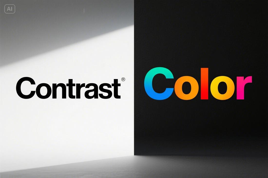
Ensure Sufficient Contrast
Text should always stand out clearly from the background. Aim for a contrast ratio of at least 4.5:1 for normal text, and 3:1 for large text, according to WCAG guidelines.
Black text on a white or light background is usually best, but high-contrast dark mode designs can also work well if done carefully.
Avoid Color Alone for Meaning
Don’t rely solely on color to convey important information. Some users may have color vision deficiencies, so always use labels, icons, or underlining in addition to color changes.
For example, don’t just highlight a link in red—underline it or add an icon.
Follow Accessibility Guidelines
When designing accessible typography, it’s important to follow established standards that help ensure your content is usable by as many people as possible.
The Web Content Accessibility Guidelines (WCAG) provide clear recommendations for creating readable, inclusive digital experiences—including specific guidance around text and typography.
Here are some key WCAG typography-related guidelines to keep in mind:
Minimum Contrast Ratios
Text should have enough contrast against its background to remain readable for users with low vision or color sensitivity.
According to WCAG 2.1:
- Normal text must have a contrast ratio of at least 4.5:1.
- Large text should have a minimum contrast ratio of 3:1.
Use contrast checker tools to test your color combinations and make sure your text meets these requirements.
Text Resizing
Users should be able to scale text up to 200% of its original size without losing functionality or content.
This means your layout and typography should adapt gracefully without breaking.
Use relative units (like ems or rems) in your CSS for web design instead of fixed pixel sizes.
Readable Fonts and Layouts
WCAG doesn’t require specific fonts but encourages using styles that promote legibility.
That includes:
- Avoiding overly decorative fonts for body text
- Ensuring sufficient line height (at least 1.5x the font size)
- Providing clear typographic hierarchy using headings, bold text, and spacing
Keyboard and Screen Reader Compatibility
Make sure all text content can be accessed by keyboard and screen readers. Avoid embedding text inside images unless absolutely necessary.
If you do use image-based text, provide descriptive alt text that conveys the same information.
Don’t Rely on Color Alone
Color should never be the only way information is conveyed. For links, buttons, and important cues, include other indicators such as underlines, icons, or bolding.
This ensures users with color vision deficiencies still receive the message.
Recommended Fonts for Accessibility
There’s no single font that works for everyone, but some typefaces are known for being more accessible.
Here are a few widely recommended fonts for accessibility.
1. Lexend
Lexend is a sans-serif font designed to improve reading fluency and reduce visual stress. It was developed based on research around cognitive load and eye movement.
Lexend features wider letterforms, generous spacing, and low visual noise, making it particularly helpful for people with reading challenges, including dyslexia.
2. OpenDyslexic
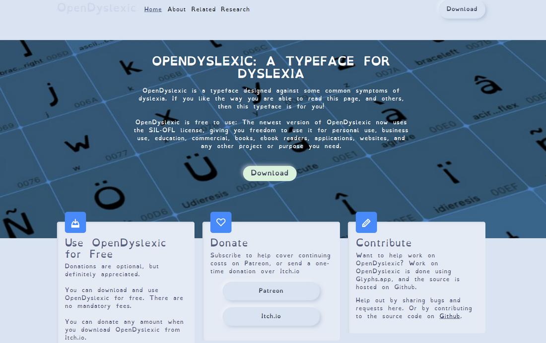
OpenDyslexic is a free font specifically created to support dyslexic readers. It uses heavy weighted bottoms to help prevent letter flipping and confusion.
Each character has a unique shape to reduce the chance of mistaking one letter for another. While the design may feel unconventional, many users find it noticeably easier to read.
3. Atkinson Hyperlegible

Created by the Braille Institute, Atkinson Hyperlegible is a sans-serif font designed for maximum legibility.
It features exaggerated letterforms, distinct shapes, and strong character differentiation, helping readers quickly recognize each letter.
It’s a great option for both low-vision users and general accessibility-focused designs.
4. Tahoma
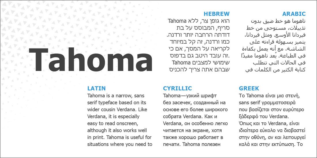
Tahoma is another system font that was built with screen readability in mind. It has a narrow, clean appearance with strong character definition and spacing that enhances clarity.
While slightly more compact than Verdana, it’s still highly readable and works well in body text and UI elements.
5. Calibri
Calibri was the default Microsoft font for years, and while it’s a bit more modern and rounded, it remains readable for many users.
It features soft curves, good spacing, and clear letterforms that work well for both print and digital content.
In Conclusion
By choosing the right fonts, adjusting spacing and alignment, and maintaining strong contrast, you make your content more readable and respectful of all users’ needs.
Accessible design helps everyone, not just those with dyslexia or visual impairments. It improves clarity, enhances user experience, and ensures your message reaches more people.
And in the end, that’s what good design is all about.