
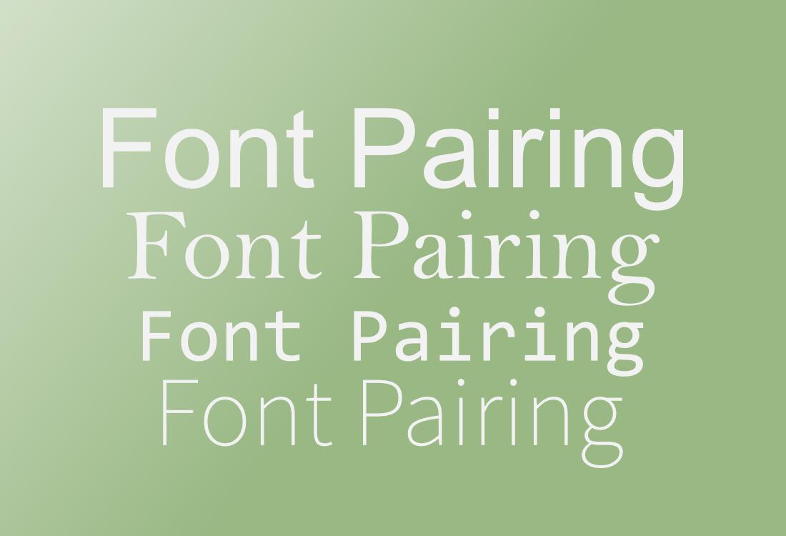
For digital-first brands, typography isn’t just a style choice, it’s a core part of how the brand communicates across screens.
The right font pairing can create hierarchy, improve readability, and define the brand’s tone without saying a word.
But with so many fonts to choose from, combining them effectively can be tricky.
Whether you’re building a design system, creating social content, or launching a responsive website, strong font pairing gives your visuals clarity and consistency.
In this guide, we’ll explore practical font pairing techniques to help digital-first brands look sharp, readable, and uniquely original.
Why Font Pairing Matters in the Digital Space
Digital-first brands rely on type to do a lot of heavy lifting, often more than traditional print-focused brands.
Text has to be readable on different screen sizes, responsive within layouts, and optimized for both quick scanning and longer reads.
Over 70% of global brands have invested in custom font creation for unique branding.
Good font pairing can:
- Guide users through content with a clear visual hierarchy
- Help users identify brand voice and personality at a glance
- Ensure consistency across multiple platforms (web, mobile, social, etc.)
- Reduce visual clutter and improve user experience
That’s why choosing fonts that not only look good together but also perform well on screens is essential.
Start with Function, Then Build Style
Before jumping into aesthetics, start by thinking about function.
What is each font doing? Is it used for headlines, body copy, buttons, or calls-to-action?
In most digital-first settings, you’ll want to pair at least two roles: a display font for emphasis and a body font for readability.
A good approach is:
- Primary font: used for headlines, hero text, and brand-defining elements. This font can be more expressive or stylized.
- Secondary font: used for body text, UI labels, or paragraphs. It should be simple, highly legible, and perform well at smaller sizes.
For example, pairing a bold serif for headlines with a clean sans-serif for body copy often creates a modern and balanced feel.
Pair Fonts with Clear Contrast
Contrast is key to a successful font pairing. Fonts that are too similar may clash or feel redundant.
Instead, look for differences in style, weight, proportion, or texture. This contrast helps users understand the hierarchy and adds visual interest.
Some reliable contrast strategies include:
- Serif + Sans-Serif: A timeless combination, where one font adds character and the other keeps things clean and readable.
- Bold + Light: Using a heavier weight for headlines and a lighter weight for body copy of the same family can create a refined hierarchy.
- Geometric + Humanist: Mixing a precise, structured font with a softer, more organic one brings balance and personality to your design.
The key is making sure the contrast feels intentional, not random.
Use Font Families That Offer Versatility
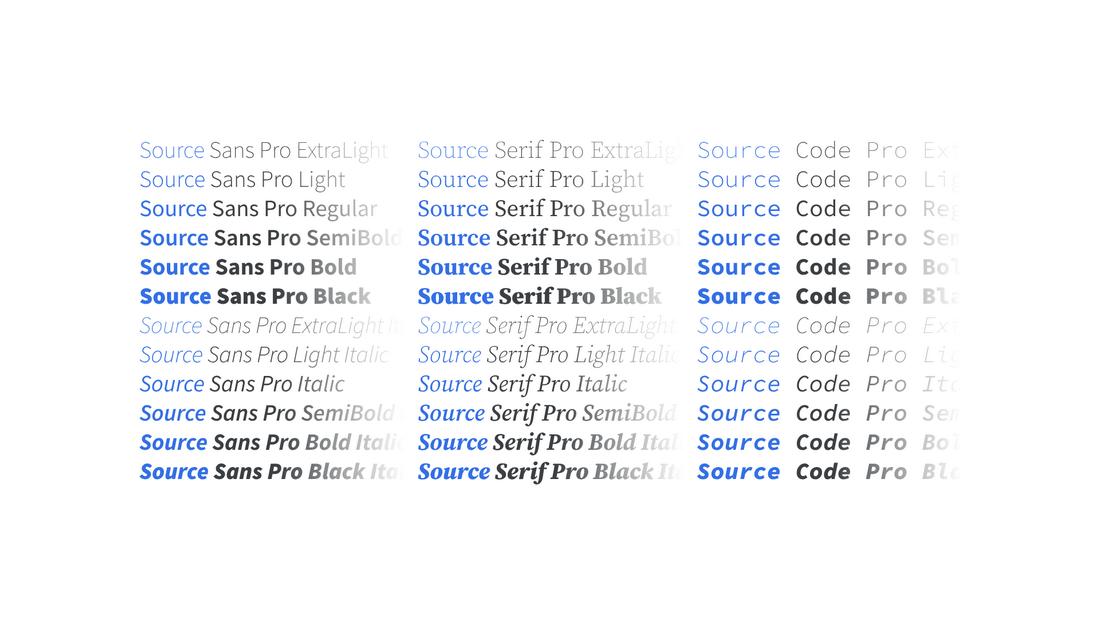
If you want a more cohesive look, using different weights and styles within the same font family can be just as effective as mixing two separate fonts.
Many modern typefaces are built as “superfamilies” with a wide range of weights, italics, and even serif/sans-serif versions.
Fonts like Inter, IBM Plex, Roboto, and Source Sans offer enough range to create hierarchy without introducing a second font.
This can be helpful in digital systems where consistency across UI components is a priority.
Use Combination Fonts
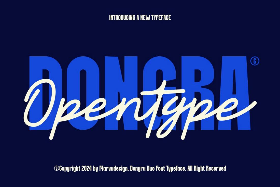
Combination fonts are font duos or bundled type families that include two matching fonts designed to work together.
These are often a display or script font paired with a clean sans-serif or serif companion.
Combination fonts take the guesswork out of pairing because the styles are built to complement each other in tone, weight, and spacing.
They’re especially helpful for designers working on brand kits, social graphics, or websites where visual consistency matters but time is limited.
You’ll often find these pairings labeled as “font duos” on marketplaces like Creative Market or Envato Elements.
Some include a decorative headline font and a minimalist body font, while others offer a mix of serif and sans-serif styles with aligned sizing and rhythm.
Consider Legibility on Screens
Not all fonts are designed with digital performance in mind. Choose fonts that are hinting-optimized or designed specifically for screen use.
Look for features like open counters, consistent stroke widths, and clear letterforms—especially for body text.
Avoid fonts that rely on thin lines, high contrast, or tight spacing if they’ll be used on mobile or small displays.
Testing fonts at various sizes and weights across screen types is always a good idea before making a final choice.
Match the Font’s Personality to the Brand
Beyond technical considerations, your fonts should reflect your brand’s tone.
A startup focused on innovation may lean into geometric or modern sans-serifs, while a lifestyle brand might use expressive serif fonts to convey warmth and personality.
When pairing fonts, think about how they interact emotionally.
Does one feel too formal next to a playful counterpart? Does the combination match the tone of your messaging?
The more aligned the fonts are with the brand’s voice, the more cohesive the experience will feel.
Limit Pairings to Keep Things Consistent
In digital branding, consistency is key. While it’s tempting to use multiple fonts to add variety, it’s usually best to stick to two to three at most across your digital materials.
This helps maintain a unified identity and makes it easier to scale your design system across websites, apps, and social platforms.
Once you’ve chosen your pair, document usage rules for sizes, weights, and where each font should be applied.
This ensures your team or collaborators stick to the system.
Test Pairings in Context
What looks great in a static mockup might not hold up in a real-world setting.
Always test font pairings in actual use cases, on a web page, mobile screen, or social graphic.
Check how the fonts behave at different sizes, how they interact with color, and whether they hold up on various devices.
This is especially important for responsive design, where fonts need to adjust smoothly across breakpoints.
A pairing that works well on desktop may need slight tweaks on mobile.
4 Tools for Finding the Perfect Font Pairing
When in a hurry, use these simple tools to find a good font pair for your projects.
1. Fontpair

Fontpair is a simple and curated tool that focuses on showcasing combinations using Google Fonts.
You can browse pairings by category, like serif + sans-serif or display + body text, and see how each combo looks with real content.
It’s easy to use, and especially helpful if you’re working with web-safe fonts that are free to use.
2. Fontjoy
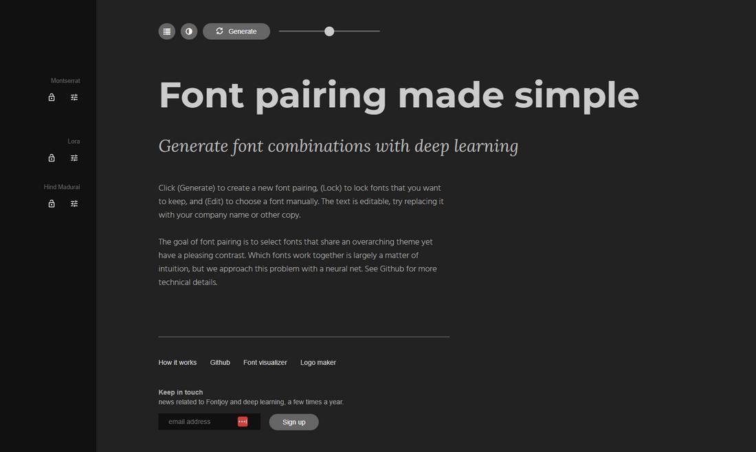
Fontjoy uses AI to generate font pairings based on contrast and visual harmony.
You can lock in one font and let the tool generate others that match well with it.
It’s perfect for designers who want something a little more experimental or who enjoy mixing classic and modern styles with just a few clicks.
3. Monotype Font Pairing Tool

Monotype’s font pairing generator is an interactive space where you can test and visualize pairings using high-quality typefaces from the Monotype library.
You can adjust text size, layout, and pairing style to see how fonts work together in a real-world setting.
It’s a powerful tool if you’re working with premium fonts and want more control over fine-tuning combinations.
4. Typespiration

Typespiration provides real font pairing inspiration pulled from user-submitted designs.
Each sample includes font names, colors, and layout suggestions, giving you an instant look at how type pairings work in full compositions.
It’s great for finding creative, ready-to-use combos you can adapt to your own brand or project.
Conclusion
Font pairing isn’t just about choosing two fonts that “look good together”; it’s about creating a system that supports your content, reinforces your brand, and feels seamless across digital experiences.
By focusing on contrast, clarity, and consistency, digital-first brands can create typography that not only looks polished but also performs beautifully in every pixel.