When it comes to adjusting space between letters, two terms come up frequently: kerning and tracking.
While they might seem similar, they serve distinct purposes in the world of typography. And having a proper understanding of the terms is a must for all types of designers.
In this post, we’ll break down the differences between kerning vs tracking, explain when to use each, and discuss how these adjustments can enhance your designs.
What is Kerning?

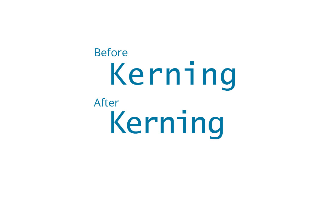
Kerning refers to the space between two specific characters (letters or numbers). It’s a precise adjustment that ensures the spacing between letters is visually balanced.
While fonts come with default spacing between characters, kerning allows you to make minor adjustments to improve the overall appearance and readability of the text.
Some pairs of letters naturally need more or less space because of their shapes. For example, the letter “A” and the letter “V” often require tighter spacing because their diagonal strokes create too much space if left unchanged.
On the other hand, pairs like “T” and “o” often benefit from additional spacing because the “T” has a wide top that might collide with the “o.”
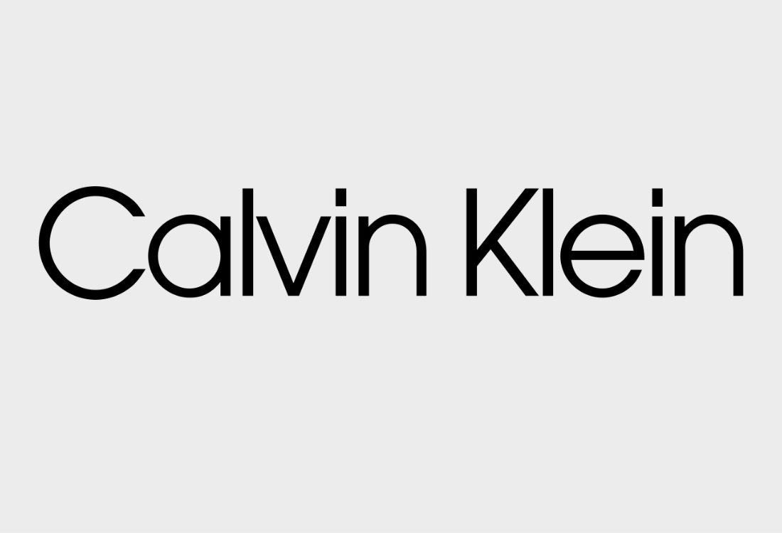
Kerning is often used for logo design, headlines, and any design work where text needs to have an exact, refined appearance.
Adjusting kerning improves legibility, creates a more balanced design, and ensures that text doesn’t look too crowded or too far apart.
What is Tracking?
Tracking, also known as letter-spacing, refers to the uniform adjustment of the spacing across an entire word, sentence, or block of text.
Unlike kerning, which deals with specific letter pairs, tracking applies the same spacing change to all characters in the text.
Tracking is useful for adjusting the overall density of a block of text. Tightening the tracking can make a word or sentence feel more compact, while increasing the tracking can create a more open, airy appearance.
Tracking adjustments are particularly helpful for fine-tuning body text, paragraph spacing, and ensuring that text remains readable at different sizes.
In web design, tracking is often used to control the spacing of lines of text, ensuring that the text doesn’t look too dense or hard to read. It can also be helpful for adjusting text alignment or creating space for different typographic effects.
Kerning vs. Tracking: Key Differences
While both kerning and tracking adjust spacing between letters, the primary difference lies in their scope and application.
Scope of Adjustment
- Kerning: Adjusts the spacing between specific letter pairs, aiming for precise, balanced spacing.
- Tracking: Adjusts the spacing uniformly across a block of text (words, sentences, paragraphs).
Purpose
- Kerning: Focuses on the visual appearance of individual letter combinations to improve legibility and aesthetics.
- Tracking: Adjusts overall letter-spacing across the text to impact readability, density, and design consistency.
Usage
- Kerning: Commonly used in headlines, logos, and titles where precise letterspacing can significantly affect the visual impact of the text.
- Tracking: Applied in body copy, paragraphs, and long-form content to ensure consistent and readable text.
When to Use Kerning

Kerning is most effective when you need to adjust the spacing between specific pairs of letters. Here are a few scenarios where kerning is essential:
- Logo Design: Tight kerning can give a logo a compact, cohesive look, while loose kerning can create a sense of openness and modernity.
- Headlines and Titles: Kerning in headlines can enhance their visual impact and make them look more polished.
- Display Text: For text that needs to stand out, adjusting the kerning ensures the letters aren’t too far apart or too close together.
When to Use Tracking
Tracking is often used when you want to adjust the overall density or spacing of text in a consistent way. Here’s when tracking comes in handy:
- Body Text: If the text is too cramped or too spread out, adjusting the tracking ensures readability and a pleasing visual rhythm.
- Text Alignment: Tracking can help adjust text so it aligns better within a column or box, especially when dealing with justified text.
- Creative Typography: When creating large blocks of text, increasing tracking can make the text feel lighter and more spaced out, while decreasing it can give the text a compact and dense look.
How to Adjust Kerning and Tracking

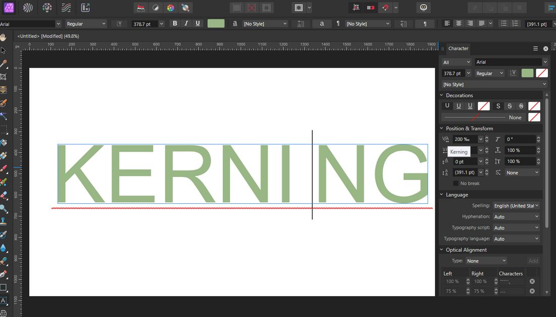
(Adjusting kerning and tracking in Affinity Photo 2)
Both kerning and tracking can be adjusted in most design software, including Adobe Photoshop, Illustrator, Figma, Affinity Photo, Affinity Designer, and Canva.
In most software, kerning adjustments are made by selecting two letters and moving them closer or further apart.
This is usually done using a kerning tool or by manually adjusting the space in the character palette.
Tracking adjustments are typically made by selecting the text block and using the tracking tool or slider in the character palette to increase or decrease the space between all characters in the selection.
10 Dos and Don’ts of Using Kerning and Tracking
When used correctly, kerning and tracking can dramatically improve the quality of your typography.
But if you go too far, or not far enough, you risk creating awkward spacing, poor readability, and an unpolished look.
1. Do adjust kerning manually for headlines and logos
Automatic kerning doesn’t always get it right, especially in large display text. Take the time to manually fine-tune spacing in logos, headlines, and titles where every letter counts.
2. Don’t over-kern body text
Kerning is great for short, impactful text, but it’s not ideal for paragraphs. Stick to tracking adjustments for body copy to maintain consistent spacing throughout.
3. Do use tracking to improve readability
When text feels too tight or too loose, tracking can help. Slightly increasing letter spacing can make small or low-contrast text easier to read, especially in all-caps or on-screen environments.
4. Don’t stretch tracking just to fill space
It might be tempting to increase tracking to make text fit a layout, but this can lead to unnatural spacing. Instead, revise your copy or adjust layout elements to maintain visual balance.
5. Do check spacing at different sizes
Kerning and tracking can look very different when text is scaled up or down. Always zoom in and out or preview at actual size to make sure your spacing looks good in all contexts.
6. Don’t use negative tracking excessively
Tightening letter spacing too much can make text hard to read. Avoid going below -20 (depending on the software) unless you’re working on a stylized heading or logo.
7. Do rely on your eyes, not just presets
Default font settings are just a starting point. Every typeface behaves differently, so trust your eyes and make visual adjustments when things don’t feel right.
8. Don’t mix kerning and tracking without a plan
Combining both adjustments can be useful, but only if you’re doing it intentionally. Unplanned changes can lead to inconsistent spacing and a messy layout.
9. Do use kerning to fix problem letter pairs
Certain combinations, like “AV,” “To,” or “Wa”, often need manual tweaks. Keep an eye out for uneven gaps that throw off the flow of your text.
10. Don’t forget to proofread your work
Spacing issues can be easy to overlook, especially after long design sessions. Step away for a moment and come back with fresh eyes—or get a second opinion to catch anything you missed.
In Conclusion
While Kerning and tracking affect letter spacing, they do so in different ways and for different purposes. In short, kerning fine-tunes specific letter pairs for balance and readability, while tracking adjusts the overall density of the text for a cohesive look.
By mastering both kerning and tracking, you can improve the visual appeal and readability of your designs, whether you’re working on a logo, website, or marketing materials.
Remember: typography isn’t just about choosing a font—it’s about how you use it to communicate effectively and aesthetically.
