Skeuomorphism and flat design are two of the most dominant design trends across web and mobile UI design. Or at least that was the case a few years ago.
Today, we only see small glimpses of Skeuomorphism-inspired user interfaces. And the original flat design style is no longer being used by designers. However, some forms of these two design trends are still very much alive and have influenced the modern website and mobile UI designs we use today.
What happened to these two design trends? How do designers use skeuomorphism and flat design styles today? Let’s dive in and find out.
An Attempt to Bring the Real World to Digital
Not so long ago, people enjoyed seeing aspects of the real world in digital interfaces. This was the go-to approach for UI design, especially back when the iPhone and smartphone interfaces were new. This design style was called Skeuomorphism.

Apple was one of the biggest companies that heavily invested in the Skeuomorphism style, mainly to craft its iOS user interfaces. Many of its app UIs featured designs inspired by real-world counterparts, like the Newsstand app that mimics the design of a newsstand.

Skeuomorphism had a strong influence on app icon designs. From the calendar app icon to the camera icon, clock icon, and many other parts of the UI featured designs that mimic real-world counterparts.
In those early days of smartphones, this approach worked perfectly, especially to get people familiar with how these apps work and introduce their functionality.
However, this design style heavily impacted the performance of the user interfaces. Before long, users wanted performance and functionality rather than digital experiences that looked “real”.
The Rise of Clean, Minimal, and Functional Design
Flat design was the perfect style for user interfaces. It offered a clean and minimal design approach that boosted performance. And above all, it promoted functionality above the looks.
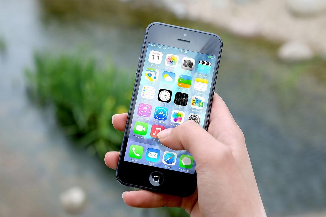
Apple, Google, Microsoft, and almost every big tech corporation rushed to adopt and incorporate the flat design style into all of their user interfaces. Apple completely revamped the iOS UI using a flat design approach while Google and Microsoft went on to introduce their own styles inspired by flat design.
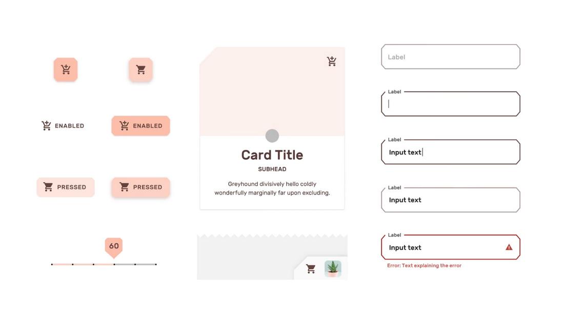
Google’s Material Design style became quite popular among web designers and an evolved version of that style is still being used by the company across its services.

Microsoft introduced Metro UI, a revamped menu design and app experience inspired by flat design for Windows 8.
However, most of these early flat design creations had short lifespans.
Flat Design 2.0 and the Decline of Skeuomorphism
With the rise of flat design, the demand for skeuomorphism started to decline. Websites and mobile interfaces that used skeuomorphism-style designs looked outdated. It just wasn’t serving a function.
Early iterations of flat design proved to be the best replacement for skeuomorphism designs. However, it wasn’t perfect. Those designs looked a bit too flat and lifeless. And it paved the way for Flat Design 2.0.
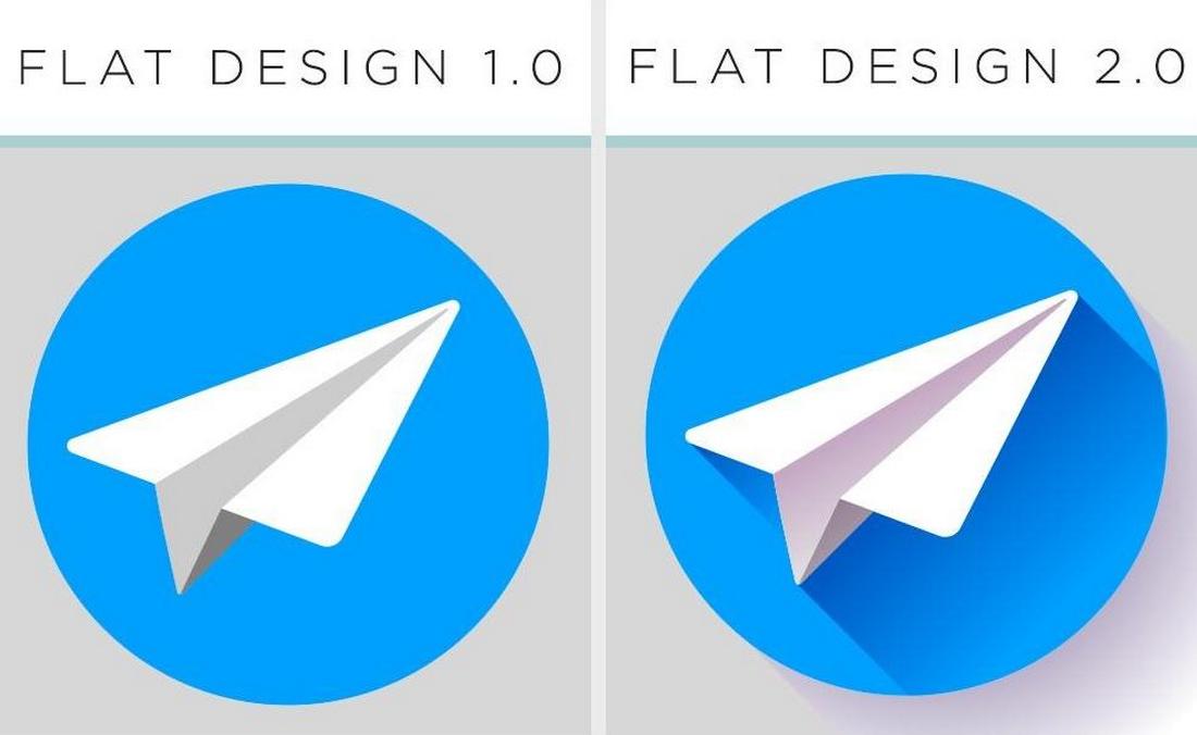
Flat Design 2.0 is considered the next generation of flat design for the web and mobile. Instead of using a fully flat design approach, the new style incorporates stylistic elements such as shadows, hues, depth, and gradients into the mix.
Today, the upgraded flat design 2.0 is the most popular choice for web and mobile designs. However, that doesn’t mean designers have completely abandoned skeuomorphism.
Balancing the Best of Both Worlds
If you look closely at modern UI designs, you’ll notice that there are influences of skeuomorphism in many different types of designs.
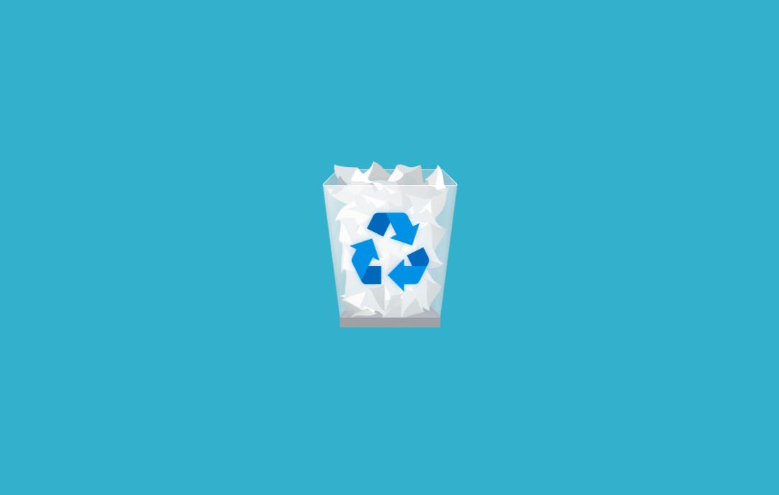
The Recycle Bin icon in Microsoft Windows still uses a skeuomorphism-style design that resembles a real recycle bin. The Clock and Notes app icons in iOS still resemble their real-world counterparts. Many of the popular music player apps, camera apps, and calculator apps also use design elements inspired by skeuomorphism.
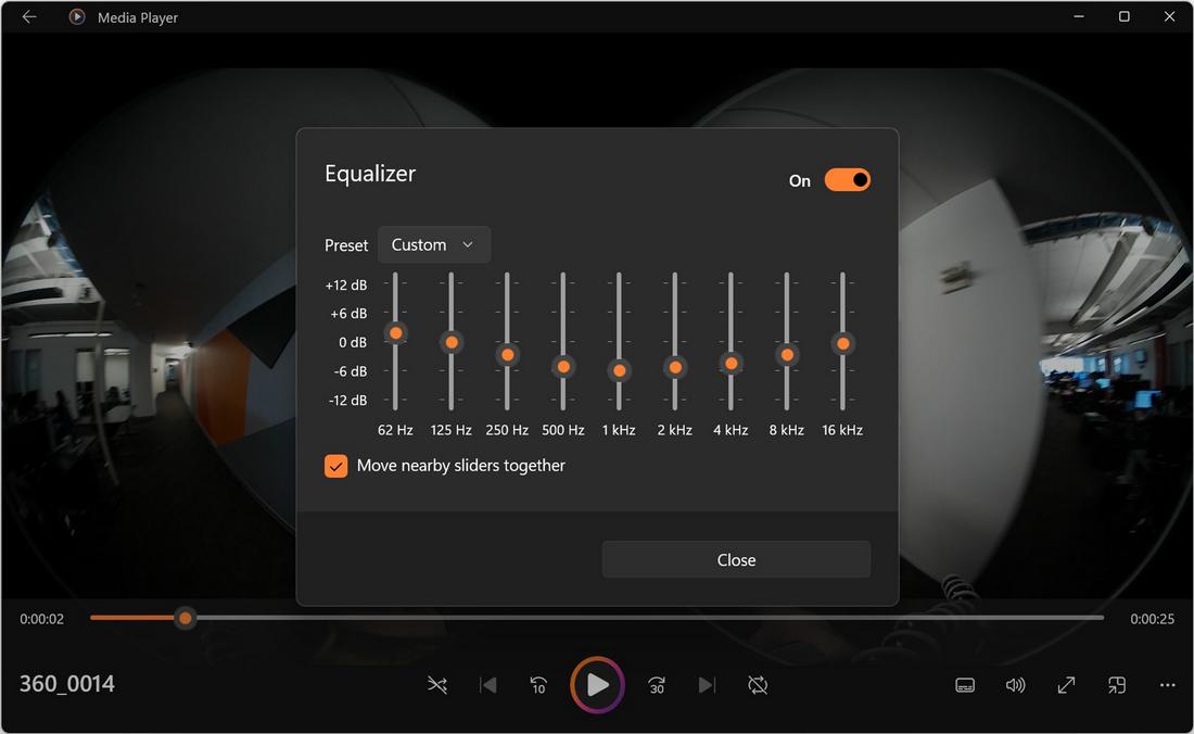
However, these modern UI designs are not 100% skeuomorphism. Instead, they use a combination of skeuomorphism and flat design to create functional designs that also resemble real-world elements.
When to Use Skeuomorphism Vs Flat Design
There will be design projects where you should use fully flat designs. There will also be projects that make sense to use skeuomorphic designs as well as to use a mix of both. Knowing when and where to use these trends is the key to creating impressive designs.
When to Use Flat Design
When it comes to creating simple interfaces with a focus on functionality and performance, flat design is the go-to approach. Modern brands use flat design as a way to showcase sophistication and clarity as well.
When to Use Skeuomorphism
Skeuomorphism comes in handy when you want to incorporate a sense of realism into your digital designs. Especially in storytelling, skeuomorphic designs play a crucial role in creating emotional connections with the users.
When to Combine Both
The dull and boring flat designs can be enhanced by adding a touch of skeuomorphism. When introducing new concepts, functions, and features, this approach will help make the onboarding process much easier.
Designing for the Future
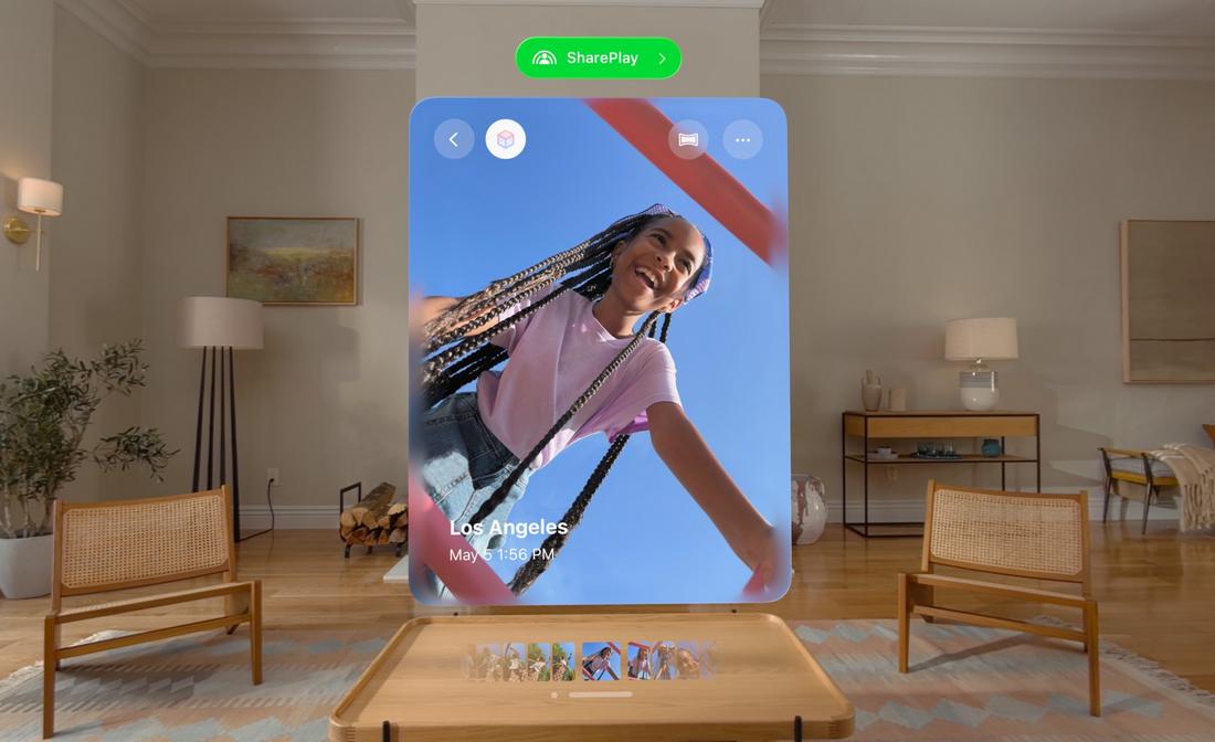
Many designers predict that in the near future, virtual reality (VR) and augmented reality (AR) experiences will play a key role in our daily activities. In these virtual experiences that blend with the real world, the skeuomorphism design approach will be the best approach to offer the most immersive user experiences.
Depending on how these new technologies progress, we might get to see skeuomorphism designs making a comeback, very soon. Given the advancements in design and tools available today, Skeuomorphism 2.0 will surely be something exciting to look forward to.
