
A great poster does more than just look good—it grabs attention, communicates a message, and leaves a lasting impression.
Whether you’re designing for an event, product, campaign, or cause, a well-structured poster can make your message more powerful and memorable.
But what actually makes a poster work?
It comes down to more than just colors and images. It’s about the way everything is arranged, how the text flows, and what the viewer sees first.
In this post, we’ll break down the essential design principles that go into building a strong, effective poster from top to bottom.
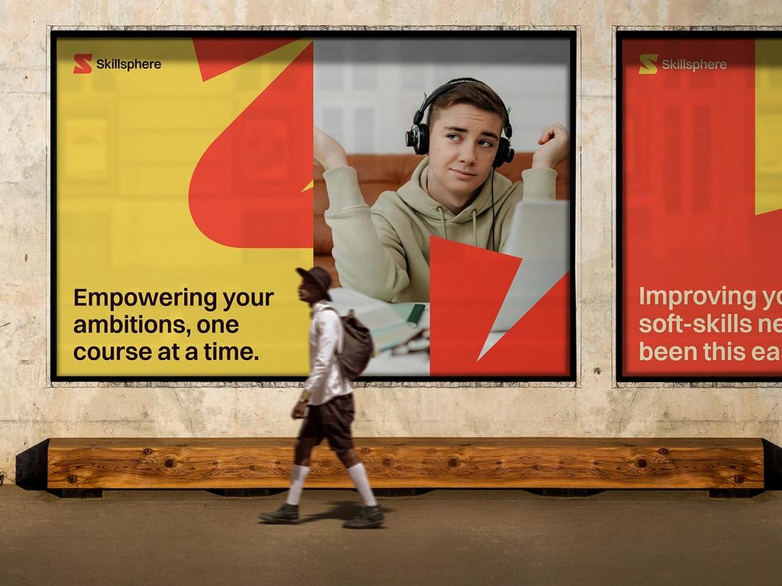
Start with Clear Hierarchy
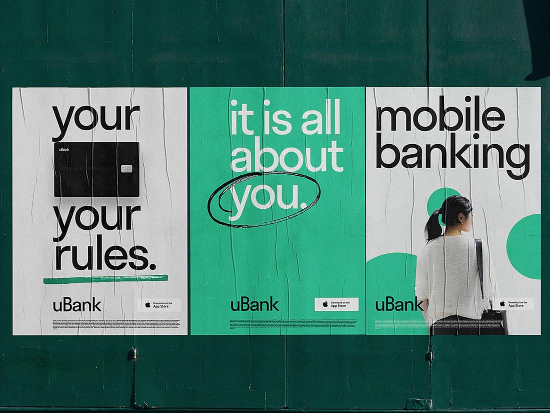
(Credit: Tubik)
Hierarchy is the backbone of any strong poster layout. It’s how you organize information so that the viewer knows exactly where to look first, and where to go next.
Without a clear hierarchy, even a beautifully designed poster can fall flat, leaving the viewer confused or overwhelmed.
Begin by deciding what’s most important. Is it the event name, a call-to-action, a headline quote, or the product you’re promoting?
That primary message should be the most visible part of your poster.
Use size, weight, and positioning to make it stand out. Typically, this is the title or focal headline, placed near the top or center to grab attention instantly.
Next, include supporting information like subheadings, taglines, or a short description.
This content should be smaller than the headline but still easy to scan. It provides context and gives the viewer a reason to keep reading.
Finally, reserve the smallest text size for the fine details, such as time, date, venue, website, or social handles.
These elements should be placed near the bottom or in a corner of the design where they’re accessible without distracting from the main message.
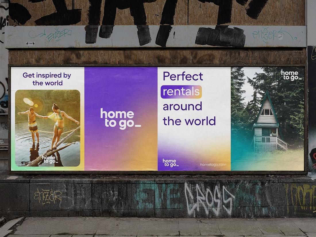
Use a Balanced Composition
(Credit: Lucas Swierad)
A good layout feels balanced and organized.
Whether you’re working with text, images, or a mix of both, everything should feel like it belongs together.
Use grids to align elements and create consistency across your poster.
Don’t be afraid of white space; it gives the design room to breathe and keeps the viewer from feeling overwhelmed.
Symmetrical layouts can feel clean and formal, while asymmetrical layouts add energy and movement. Choose your approach based on the mood you want to convey.
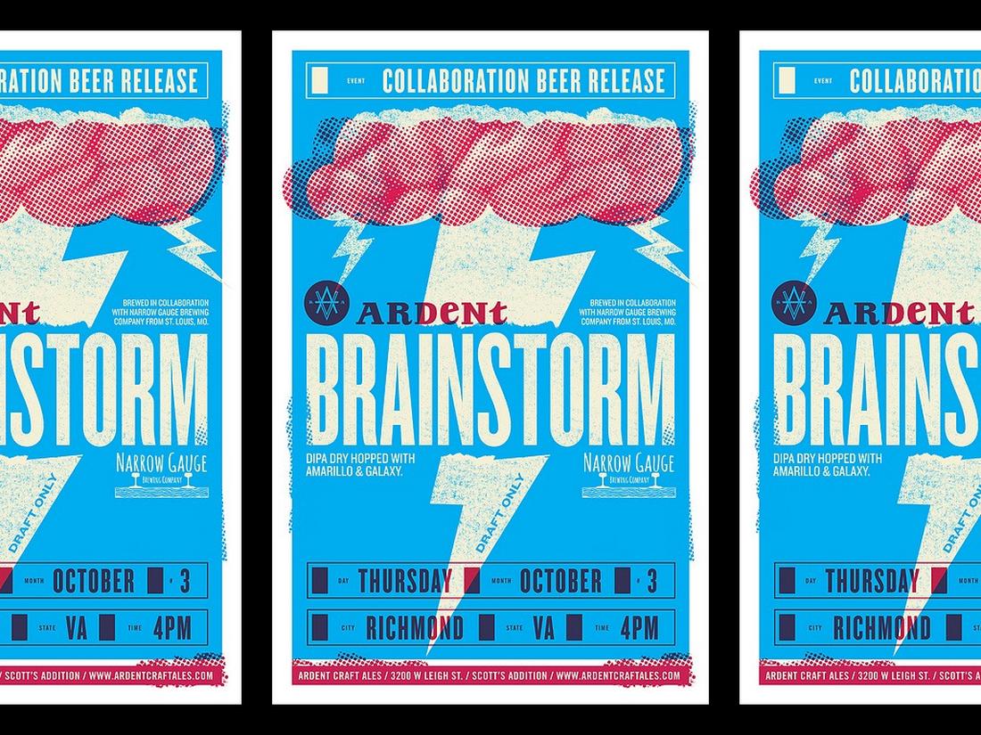
Typography Matters More Than You Think
(Credit: Daniel Ross Luft)
Fonts aren’t just decorative, they set the tone of your message.
Choose typefaces that fit the style of your poster, and use no more than two or three in a single design.
Contrast is key. Pair a bold headline font with a simpler body font to keep things readable.
Pay attention to line spacing, letter spacing, and alignment. Good typography is not only stylish, it’s legible at a glance.
Make sure your poster can be read from a distance, especially if it’s meant for public spaces.
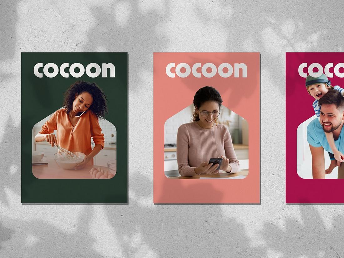
Choose Colors with Purpose
(Credit: tubik.arts)
Color can be eye-catching, emotional, and informative all at once.
Use your color palette to support your message, highlight key elements, and create contrast. Bright colors can energize a design, while muted tones can bring sophistication or calm.
Stick with two to four main colors for clarity. Use contrast between text and background to keep everything readable.
If your poster includes a call-to-action or focal point, color is a great way to draw the eye to it.
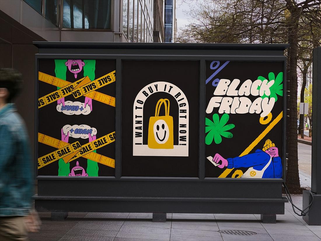
Include a Strong Focal Point
(Credit: Tubik)
Every poster should have one visual or text element that acts as the anchor. This could be a bold title, an illustration, a photo, or even a powerful quote.
The focal point is what grabs attention and invites the viewer to explore the rest of the design.
Make sure this element stands out through size, color, or placement.
Once you’ve established the focal point, structure the rest of your layout to support it without competing for attention.
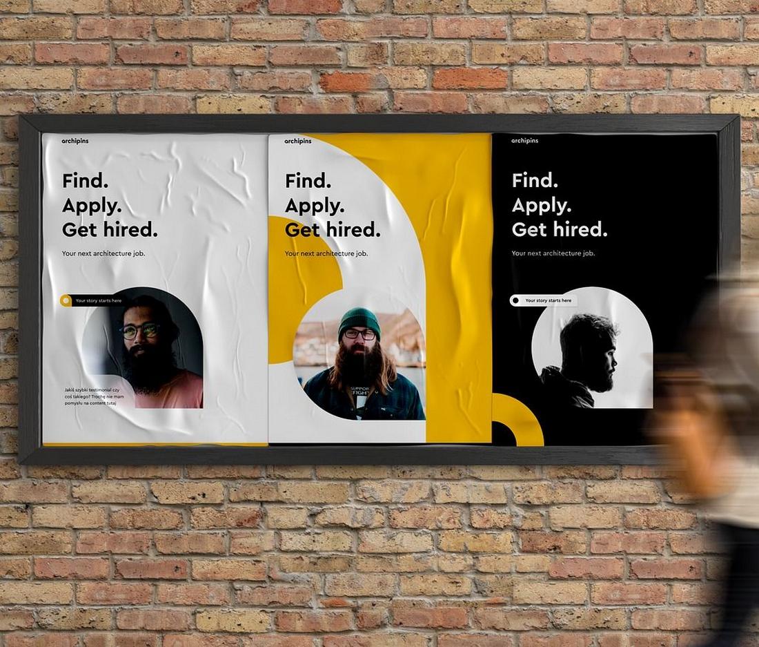
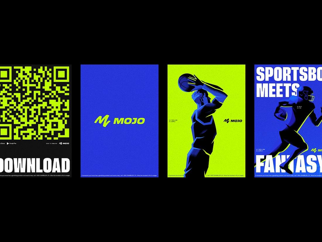
Use Visual Elements to Support the Message
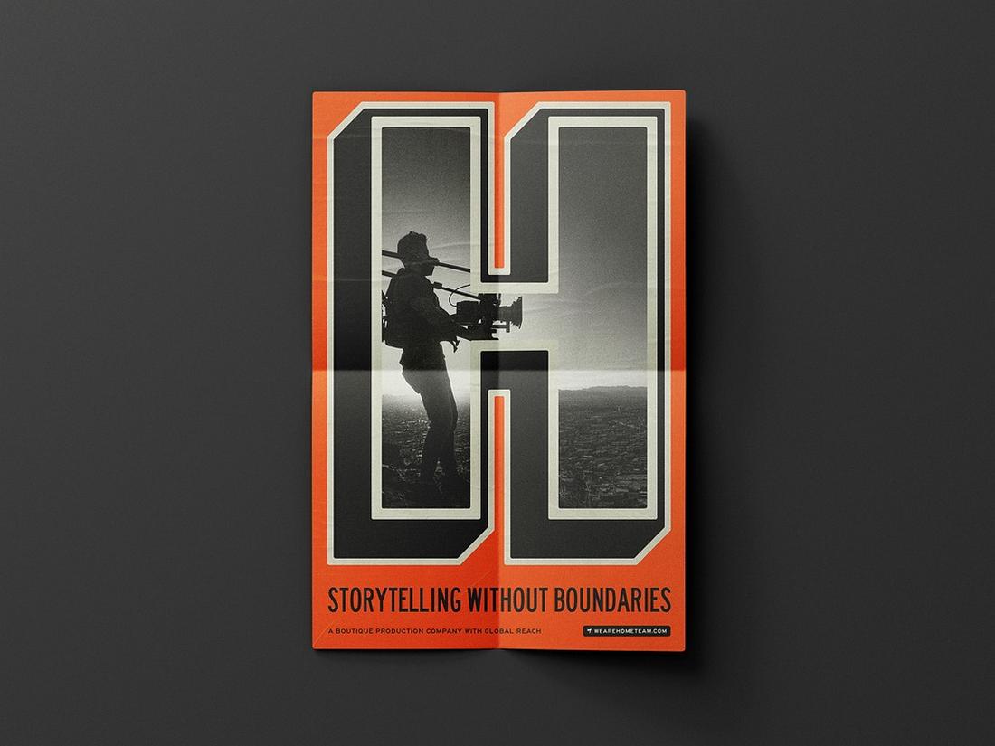
(Credit: Hannah Smith)
Imagery, icons, and shapes aren’t just for decoration, they help tell the story. Choose visuals that are relevant, high quality, and well-integrated into your layout.
Avoid using stock photos that feel generic or disconnected from the content.
Use illustrations, textures, or graphic accents to add character and enhance the tone.
Just be sure these elements support the message and don’t overcrowd the design.
Make Room for Key Details
(Credit: Blake Cale)
Posters often need to include important information, event dates, locations, contact info, or social handles.
These details should be clear and easy to find but shouldn’t overpower the design.
Place this content lower on the poster or in a dedicated info section.
Use a smaller, clean font that’s still legible, and avoid cramming too much into a small space. If needed, use icons or dividers to organize the information.
Keep It Simple and Focused
(Credit: Keitoto)
A common mistake in poster design is trying to say too much. Keep your message focused.
One core idea is more effective than five competing thoughts. Edit your copy ruthlessly and only include what truly matters.
Simple posters tend to be more memorable.
Limit your elements to what’s necessary and use space, type, and contrast to make those pieces work harder.
Design for Your Medium
(Credit: Shea Lewis)
Where will your poster be displayed? A poster on a street corner needs bold visuals and short text.
A digital poster for Instagram Stories might need vertical formatting and animation.
Think about where and how the poster will be seen, and adjust your design accordingly.
Test your layout at different sizes or distances to make sure your message is still clear and readable.
7 Tips for Designing an Effective Poster
These tips will help you design posters that are not only visually striking but also functional and clear.
1. Think From a Distance
Before getting into the details, take a step back. A good poster should be legible from several feet away.
Use large, bold text for your main message and limit the amount of content so it’s quick to scan.
2. Stick to One Main Message
Focus your poster on one clear goal. Trying to promote multiple things at once can dilute your impact.
Whether it’s selling tickets, announcing a release, or raising awareness, make the central message obvious and easy to remember.
3. Use a Grid to Organize Content
Grids help bring structure and balance to your layout.
They make it easier to align elements, maintain consistent spacing, and keep your design looking polished, especially when working with both text and images.
4. Let Typography Lead
In many posters, type does most of the heavy lifting. Use size, weight, and contrast to establish a hierarchy and guide the viewer’s eye.
Choose fonts that match your tone—playful for events, bold for campaigns, clean for professional use.
5. Be Smart With Color
Use color intentionally to draw attention to key elements and create mood. High contrast improves readability, while a limited palette keeps things clean and cohesive.
Avoid using too many colors unless you’re intentionally going for a chaotic look.
6. Don’t Overcrowd the Design
White space is your friend. It helps important content stand out and gives your design breathing room.
If something isn’t essential to the message, consider cutting it. Less clutter means more impact.
7. Test and Get Feedback
Once your poster is nearly done, print it out or view it full screen and step back. Can you read it quickly? Does it feel balanced?
Show it to a friend or colleague to get fresh eyes on it. Sometimes a second opinion can spot what you missed.
In Conclusion
Great poster design comes down to structure, balance, and clear communication.
Whether you’re designing for a band, a campaign, a product, or just for fun, following these principles will help you create posters that not only look good, but do their job more effectively.