
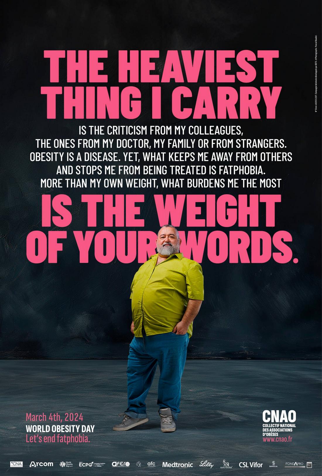
Typography can make or break a poster. Whether it’s promoting a concert, a campaign, or a product, your message has just a few seconds to catch someone’s eye.
While color and imagery play a big role in a poster design, it’s the type that often carries the core message and determines whether people stop to read or walk right past.
Great poster typography is about more than picking a good-looking font. It’s about making the message readable, engaging, and impossible to ignore.
In this post, we’ll look at best practices for choosing typefaces, setting font sizes, and placing text so your poster not only looks good, but also communicates clearly.
Start with a Strong Visual Hierarchy

The first thing to get right is hierarchy.
Viewers should be able to understand the most important part of your message at a glance, even from a distance.
Typically, posters follow this structure:
- Headline: The main message, usually the largest and boldest text on the page.
- Subheading: Supporting information that gives context to the headline.
- Body Copy: Additional details such as date, time, location, or a short description.
Use size, weight, and placement to separate each level. A bold sans-serif headline, a lighter subhead, and a clean body font often work well together.
Just make sure your type contrasts enough so each section is easy to distinguish.
Choose the Right Typeface
The typeface you choose sets the tone of your poster.
A sleek, geometric sans-serif feels modern and clean. A bold serif might suggest something more traditional or academic. A script font adds personality, but should be used carefully to avoid legibility issues.
Here are a few tips for picking a poster-friendly font:
- Look for strong letterforms with clear shapes, especially for headlines.
- Avoid ultra-thin or overly decorative fonts for large blocks of text.
- Use no more than two to three typefaces per poster to maintain visual clarity.
- Consider fonts with multiple weights and styles for flexibility.
If you’re unsure, start with a sturdy sans-serif for your main type and add a contrasting serif or display font for flair.
Set Font Sizes Based on Viewing Distance
One of the biggest mistakes in poster design is using fonts that are too small to read from a reasonable distance.
Think about where your poster will live, a hallway, storefront, event space, or social feed, and adjust accordingly.
As a general rule:
- Headlines should be large enough to read from at least 5–10 feet away.
- Subheads should be slightly smaller but still visible from 3–5 feet.
- Body text (like contact info or event details) should be clean and legible at arm’s length.
There’s no single “right” size, but trust your eye and test your design by zooming out or printing a sample at scale.
Use Contrast to Improve Readability
High contrast between text and background is essential for readability.
If your poster uses bright or busy visuals, be extra mindful of how your type sits against them.
Here are a few ways to improve text contrast:
- Use dark text on a light background—or vice versa.
- Add a slight drop shadow or outline to text that sits over photos.
- Use solid color blocks or gradients behind text areas for clarity.
- Avoid placing important text directly on top of detailed imagery.
If your design sacrifices readability for style, it’s time to rethink the layout. The message should always come first.
Align and Space Your Text Thoughtfully
Text alignment affects how your poster feels. Centered type can look balanced and formal, while left-aligned text often feels more modern and dynamic.
Whichever you choose, keep it consistent throughout the design.
Also, pay attention to spacing:
- Line height (leading) should allow enough breathing room for multi-line text.
- Letter spacing (tracking) may need slight adjustment at large sizes.
- Don’t cram text too close to the edge—use margins to frame your content.
Well-spaced typography feels easier to read and more professional. It also helps guide the viewer’s eye through the design in a natural flow.
Use Text to Support (Not Compete With) Graphics
If your poster includes bold visuals or photography, let the type work in harmony.
Don’t overload the design with text. Use it to highlight the message and direct attention.
Here’s how to strike a balance:
- Place key text in “quiet” areas of the image where it can stand out.
- Keep your headline short and punchy—just a few impactful words.
- Break longer blocks into small sections or bullet points if needed.
- Make sure all text aligns with the overall tone and mood of the visual.
When typography and imagery work together, the message becomes more cohesive and memorable.
Test Your Poster from a Distance

Before finalizing your design, print it out or view it at a smaller scale.
Step back and see if the headline still pops. Is the key message clear? Can you read the event info quickly?
Sometimes what looks balanced on-screen feels too small or too crowded in real life.
Adjust as needed based on how your poster will actually be seen, whether it’s on a wall, window, or digital feed.
7 Tips for Choosing the Best Fonts for Posters
Here are 10 practical tips to help you choose fonts that make your poster stand out.
1. Go Big and Bold
Your headline needs to grab attention from a distance. Choose a font with thick, bold strokes that won’t disappear when viewed from across the room.
Delicate or ultra-thin fonts might look elegant, but they often lack the impact needed for posters.
2. Match the Font to the Message
Think about the tone of your event or campaign. A modern sans-serif might work well for a tech conference, while a playful handwritten font could fit a kids’ event.
Your font should visually support the content you’re presenting.
3. Limit the Number of Fonts
Stick to one or two fonts for the whole poster, maybe three at most. Too many fonts can feel chaotic and make your layout harder to follow.
Use variations like bold, italic, or different sizes to create hierarchy instead of mixing typefaces.
4. Pair Contrasting Fonts Carefully
If you’re using more than one font, choose a pair that contrasts in style but still feels harmonious.
A clean sans-serif for body text and a bold serif for headlines is a classic, easy-to-read combo that works in many situations.
5. Use All Caps Strategically
All caps can give a strong, commanding look, especially for short headlines. But using them for long blocks of text can hurt readability.
Reserve uppercase type for small bursts where you need maximum impact.
6. Look for Fonts with Multiple Weights
Choosing a typeface that comes in a range of weights, like light, regular, bold, and extra bold, gives you more flexibility to create contrast and hierarchy without switching fonts.
This keeps your poster consistent and easier to scan.
7. Consider Font Licensing
If you’re planning to print or share your poster commercially, make sure the fonts you choose are properly licensed for that use.
Many free fonts are only allowed for personal projects, so always double-check before publishing.
In Conclusion
When used intentionally, text does more than just deliver information; it creates energy, emotion, and connection.
Start with your words. Set them in type that speaks. And let your poster do what it’s meant to do: stand out and be seen.